
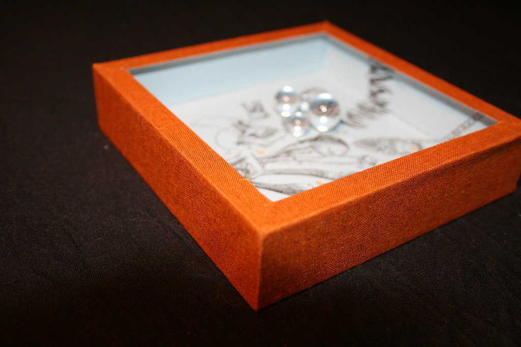
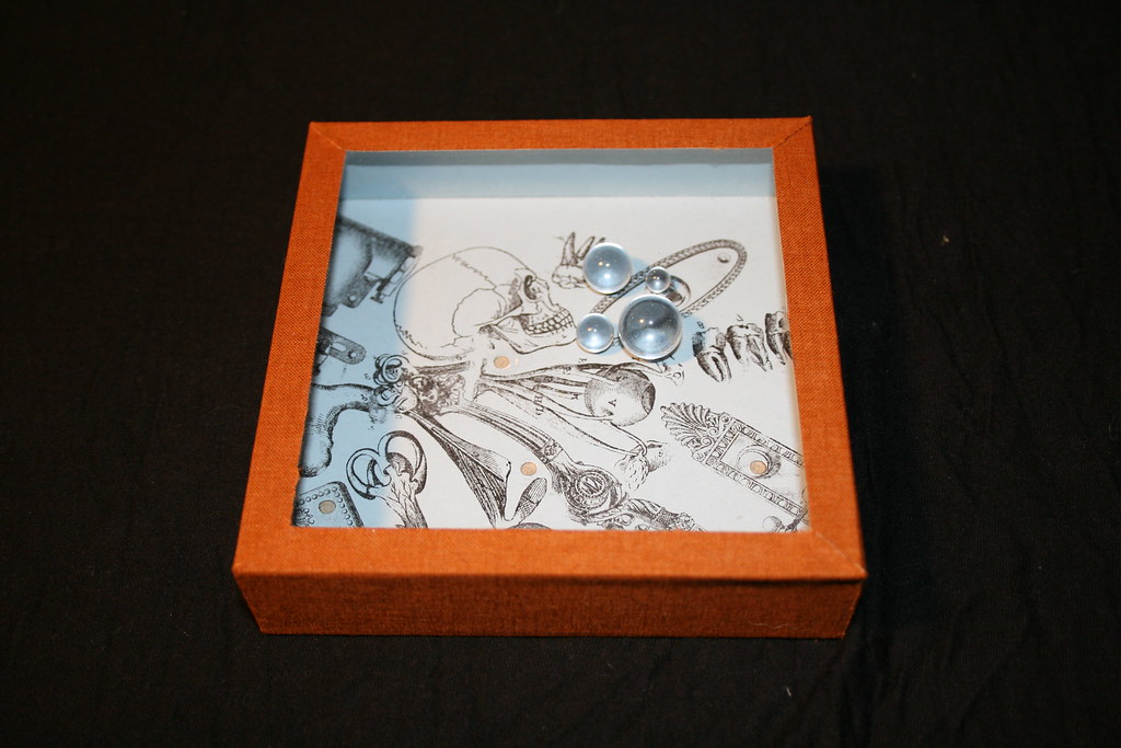
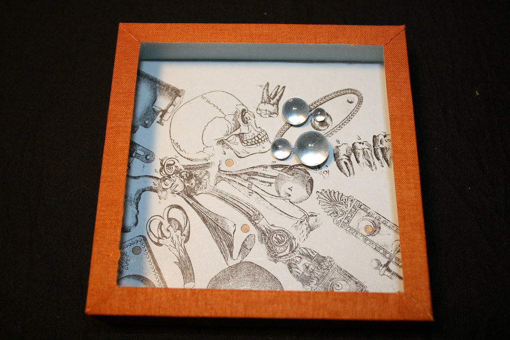
This was made over the summer. The box is constructed from Davey board, and plexiglas. The interior is glass marbles, and rub down transfers on paper. It's an interesting juxtaposition of our working parts, and industrial working parts. Mostly parts from a door, and skeletal bones and organs. My intention was to align the concepts of open door policies and the complexity of the human condition.
Thursday, December 25, 2008
"Mechanics" Puzzle Box
Thursday, December 11, 2008
"Tidal"


So voila, c'est fini. A week early, and I am really pleased with it. Going home to sleep, and seeing it the next day and not wanting to make any changes excites me. As I mentioned yesterday, there is an edition of five, so I have only constructed this one.
I might hold onto them, or put them on to my Etsy so people can have the experience (I don't want to say "fun,") of constructing their own piece.
Now, I have to delve into After Effects and complete my Motion Graphics final.
Wednesday, December 10, 2008
"I knew"
Better photos of the final construction tomorrow, but here is a preview of my final for silkscreen. I went to a gallery opening for Katy Stone last month and fell in love with her work. She creates three dimensional space with transparent and opaque layers. I wanted to explore that concept and silkscreened hand-drawn type and autographic shapes onto acetate and tissue paper. Well, Grafix Dura Lar. Using a limited color palette of light blues, warm gray, near black, and white I replicated my screens to have five runs of each color. There are enough runs to create five of these sculpture/books. The one I sewed together today is approximately three feet long.
It's layers create tension because the components are loosely rendered by hand and the textures and colors keep the eye moving back and forth in the space between them. The acetate allows the viewer to peer through the piece, but also keeps it dynamic by reflecting light and changing the appearance of the individual layers. The ink is completely matte, and the contrast between ink and substrate is high.


Monday, December 8, 2008
The Weather Outside Is Frightful

Reminded by the need to wear mittens whilst riding my bike that it is, in fact, December, I have redesigned the blog. I will have a real devoted portfolio site by Spring.
Currently, I am neck deep in finals. School has a dwindling two weeks remaining of this semester and I am definitely feeling it.
- I have a wedding invitation project that I can't wait to post about.
- A wonderful interior designer that I am working on a site with. Her work is fantastic! It makes me miss the industry.
- And, of course, an empty Etsy shop that has lots of new prints that just need to be photographed.
Tuesday, October 28, 2008

Wednesday, October 22, 2008

Monday, September 8, 2008
Hoefler & Frere-Jones release a new font!

Archer, is a playful slab-serif and it is gorgeous. It has featherlight weights that in large sizes would be amazing to create almost a texture with your body or headlines. There are small, rounds at the serifs.
I want it, I want it!
Wednesday, August 27, 2008
Earry Canal Tunnel Book
I finished summer semester three weeks ago and have a bunch to post about. I FINALLY got a better camera and love using it. Therefore, I don't expect my updates to be so sporadic as previously. I am by no means about to start calling myself a photographer, but having a nice camera is exciting.
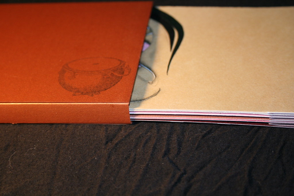
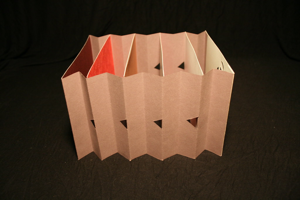
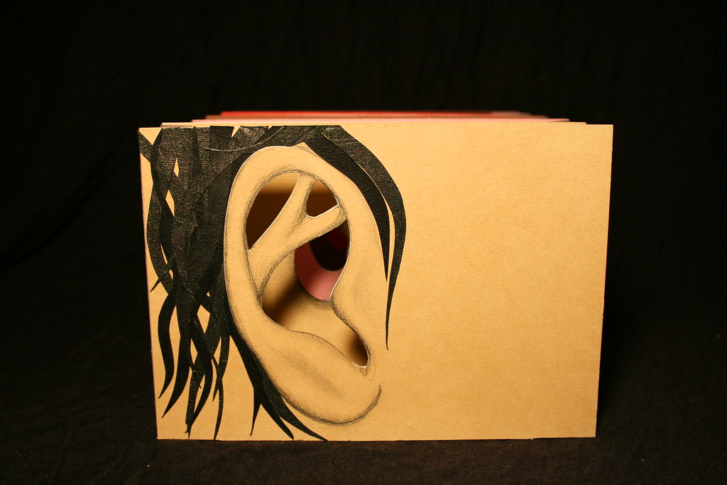
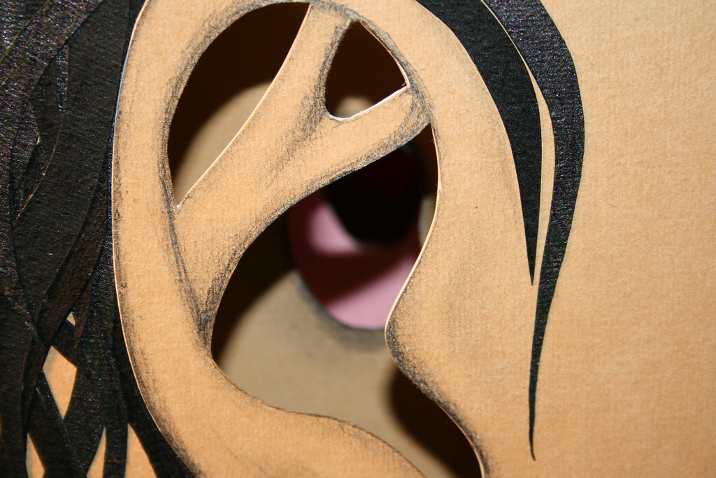
This previous semester I took Book Arts and Digital Imaging. Visually, I am more proud of what I made in Book Arts. This is my tunnel book "Earry Canal" with hand drawn and collage elements. As you look into the book there are stamped hands with pointed fingers, cut paper ear wax, and eventually a hand drawn drum with sticks. This is probably my favorite piece I made in the class.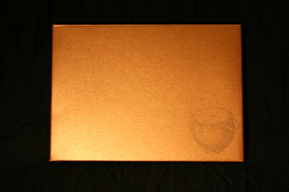


Sunday, June 15, 2008

Saturday, June 14, 2008


Friday, June 13, 2008
Design*Sponge: Regional Round Up Portland, Maine

GAH! Just when I was feeling comfortable so far from home, Design*Sponge does a feature on Portland! Also, while I was snooping about, I found that I missed (as well as not eligible) for their scholarship. Zut alor!
Sensory Appeal
The fourth assignment for Concept was to use texture to communicate "pain" or "pleasure." The first time around on this project I used stiletto heals for my "pain" portion. The heals themselves were incredibly shiny, black, and more or less screamed sex appeal. Sure, they might be uncomfortable to wear, but aesthetically they are very smooth and more in line with pleasure. A trip to a thrift store on 16th St in the Mission district found me my painful texture. Just thinking about putting that sweater on ever again makes my neck itch.
Curves Ahead Print Ads
The third assignment for Concept was to photograph a vehicle and prepare the photos to be used by a company called "Curves Ahead" in print ads. The company is assumedly large and does not need copy of introduction. I originally used my Bianchi San Jose, but although using a bike would help communicate separation from car culture, greener living, fitness, yadda yadda the on emphasis was supposed to be on shape. As sexy as I think my bike may be, it is comprised of hard steel and straight lines. There is a car dealership on Van Ness that was nice enough to let me in and snap a few photos of a gorgeous Lambourgini. I'm not a fan of cars anymore, but this car was dripping with sex appeal. The curves that it was sporting were both feminine and chiseled like a man's jaw.
Viewpoint
The second assignment in Concept was to capture a building in such a way as to make the viewer want to visit it. To be honest, I can not remember what building this is, it is downtown in San Francisco and is home to a bank. US Bank? Regardless, the architecture is what attracted me, and I captured exactly what drew me in. The combination of hewn stone, hard angles, fragile glass structures, and organic line work on a building were completely gorgeous and intriguing to me. Taking a squared, smoothed, and harsh material such as granite and utilize it for building looming structures can often feel so lifeless, and sterile. The architect kept his materials in mind and was able to take the edge off by carving circles and curves. I used to work as a designer for a tile and stone showroom, and it's great to see how beautiful those materials can be in action.


Fastenate Print Ads
Our first assignment in Concept this spring semester was to create four print ads to pitch to the fictitious paperclip company, Fastenate. These were my designs, I was really pleased with them when I was first working on them. They were comp'ed in Photoshop (which is unusual for me), and we primarily based off of scans I made of cut paper and paperclips. The exception is the "don't you look smart" design, which was done entirely in Illustrator.


Wednesday, June 4, 2008
Welcome to the beautiful Bay Area of California
School has been out since May 17, it's been a good two weeks since I have attempted anything within my major besides download sitepoint's "The Photoshop Anthology: 101 Web Design Tricks & Techniques" by Corrie Haffly. Literally, just opened it and have very little to say about it currently. It's free (for now!), so if you are interested , get it now.
I am also skimming through Ben Hunt's "Save The Pixel: The Art of Simple Web Design." There is a sample chapter available for download on his site, and it definitely seems well worth the money. He has a very no-nonsense style that I think a lot of us as web designers need to re-adhere to. With Web 2.0 and gradient madness, and just stock options that it almost seems that people are picking from, it's nice to read a voice that knows very well what it takes. Immediately, I am adopting the term JFDI (Just Fucking Do It). Ben has has a great tone for the material.
I have so much to update and upload, but unfortunately, I left my precious external hard-drive in Seattle last weekend and (bad practice!) all of my final versions from my Concept class, as well as my Design Tech class are on it.
I opened a, currently empty, Etsy shop. This will in the future be filled with prints of my original artwork, as well as crafted goods for people and our better halves (dogs!)
My summer semester starts June 16th, and I am frantically trying to assemble a portfolio... well frantic is not the correct word. But regardless, I am trying to REMAKE my portfolio that was lost somehow in Maine at my father's house.
Ever lose a large body of work? Ouch.
Friday, May 23, 2008
Sunday, May 4, 2008
Baphomoose
Everyday for the next two weeks I am hoping to make a post of what I have been up to this semester. I have been struggling to compose a hybrid between a deer and a elephant for the last two weeks or so, and in my sketches I transformed my deer antlers into moose antlers. Eventually, probably induced by recent musical selections and other ideas for additional projects, a new hybrid was birthed. This is somewhat a homage to my home state of Maine, and is my attempt at turning being homesick into productive energy. Etching on 4x5 zinc plate, edition of 15.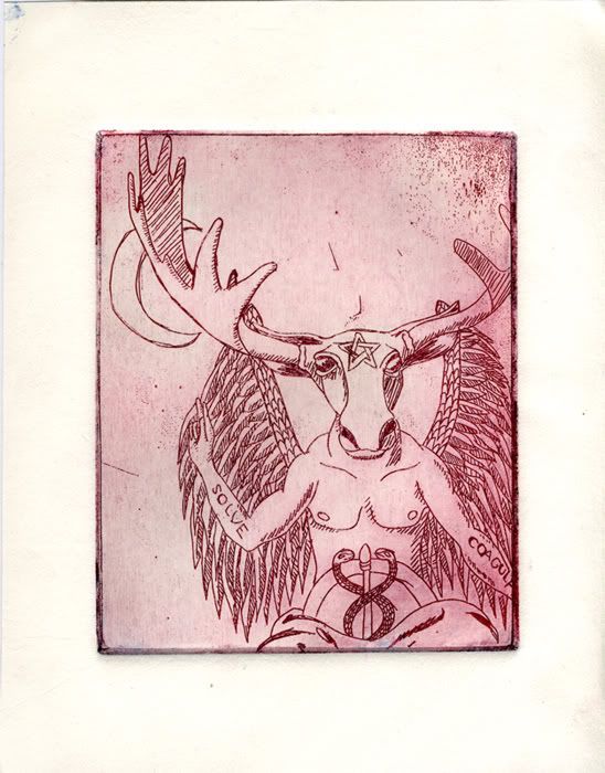
Tuesday, April 22, 2008
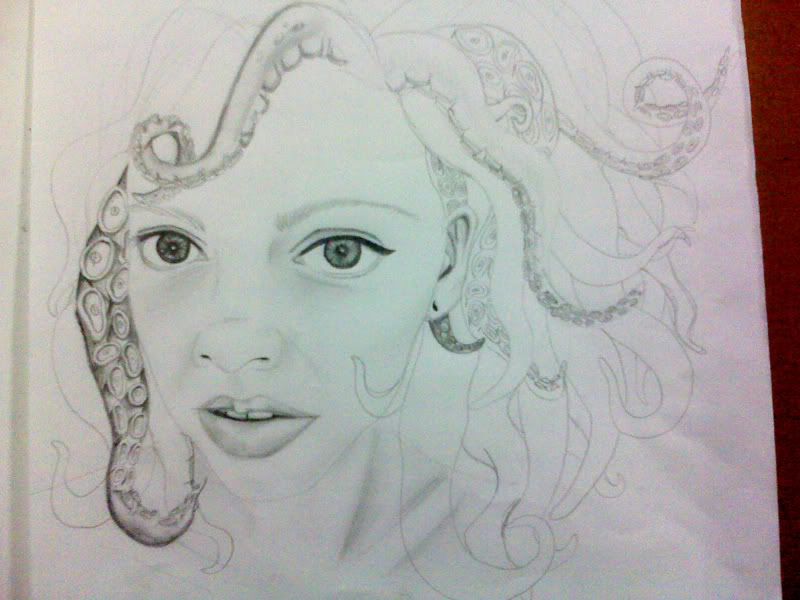
Nevermind the sketches. Behold! The (finished) tentacurl.
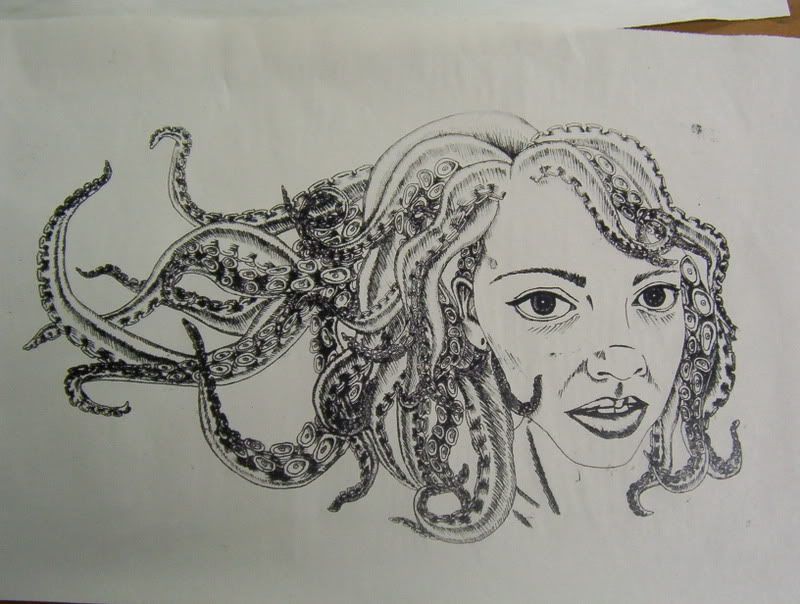

This is an edition of five, and I use the term "edition" loosely. This was created using a polyester lithograph plate and the plate was determined to make my thousands of shade lines into a much more sinister, over-inked mess. The first image is one of my initial prints onto newsprint, and although it is essentially perfect, it being on newsprint makes it worthless. the remained look nearly identical to the lithograph plate I have pictured. I'm kind of in love with it. I wasn't impressed when it initially started to fill in my line work, but I just let the process happen and I am more than happy with it now. These are not for sale (sorry!).
Sunday, April 20, 2008
Spring Cleaning

I have redesigned Base Aesthetic, instead of finishing the "tentacurl" pronto plate this morning. This is more than likely just going to be temporary until I get my portfolio site up, but it is definitely in sync with my sketchbooks and mind-maps that I make during my creative process. So for now, it's appropriate. Let me know what you think!
Thursday, April 17, 2008
Monday, April 7, 2008
Seattle Museum of Art
Things seem to come full circle now-a-days. There was a class recently in my Concept course that we discussed what it takes to be a great designer. Knowing your art history and being a sponge while observing the world. Bob showed us a reel that had launched someone's career and it was a gorgeous take on traditional Japanese imagery and incorporating it in a new way.
One thing that really stuck out to me was in the reel, the clouds were very thin and elongated. To admit my ignorance, I had never seen this rendition of clouds before. While I was in Seattle in February, nearly a week after watching that movie, I visited the SAM and hanging on the wall was a tradtional Japanese theatre komono... With the clouds!

Subscribe to:
Posts (Atom)