Archer, is a playful slab-serif and it is gorgeous. It has featherlight weights that in large sizes would be amazing to create almost a texture with your body or headlines. There are small, rounds at the serifs.

I want it, I want it!

Archer, is a playful slab-serif and it is gorgeous. It has featherlight weights that in large sizes would be amazing to create almost a texture with your body or headlines. There are small, rounds at the serifs.
I finished summer semester three weeks ago and have a bunch to post about. I FINALLY got a better camera and love using it. Therefore, I don't expect my updates to be so sporadic as previously. I am by no means about to start calling myself a photographer, but having a nice camera is exciting.
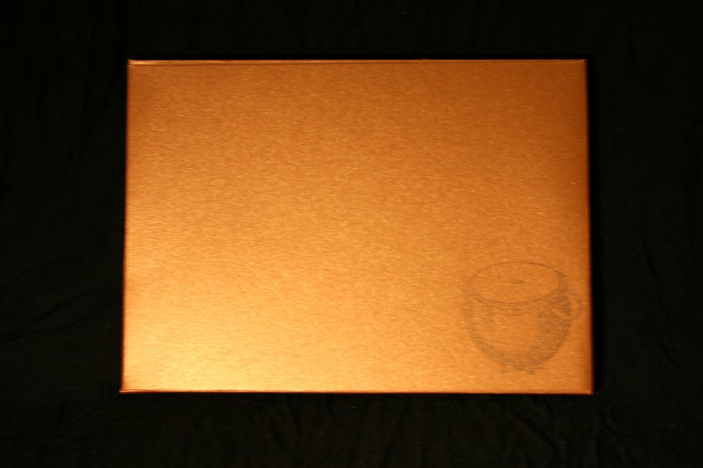
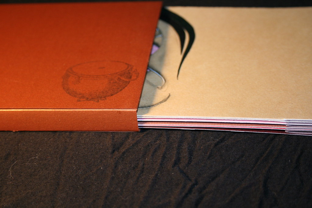
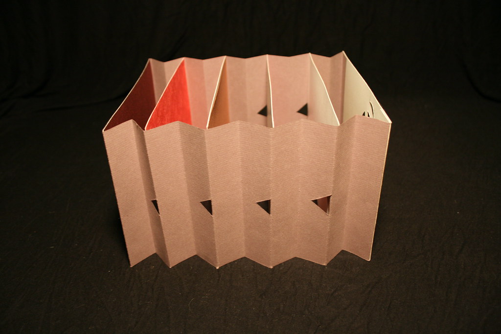
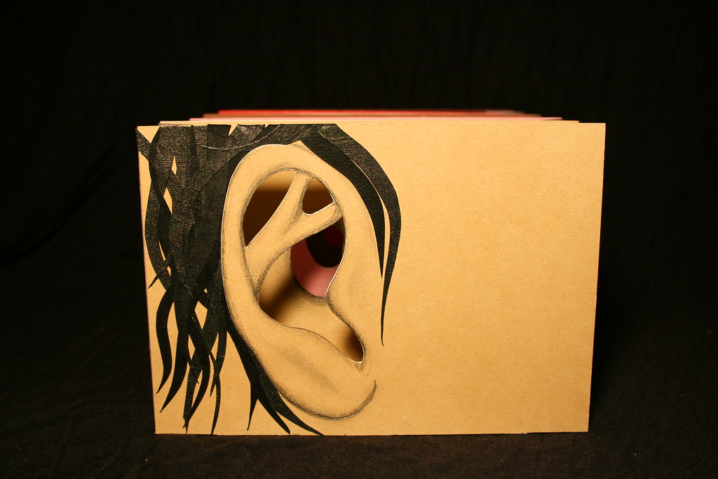
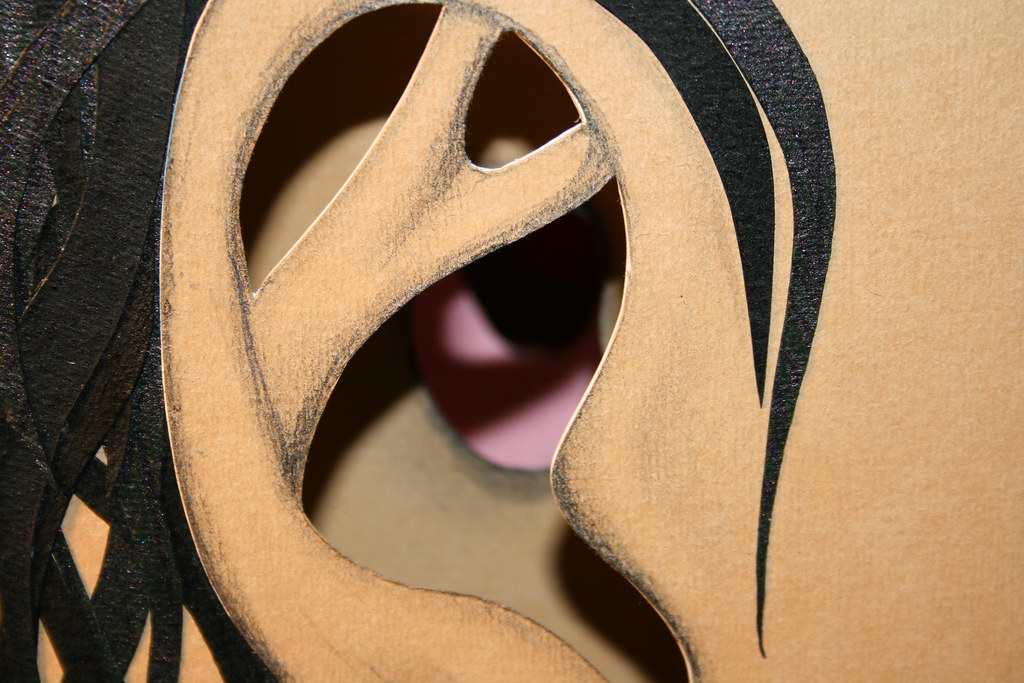
This previous semester I took Book Arts and Digital Imaging. Visually, I am more proud of what I made in Book Arts. This is my tunnel book "Earry Canal" with hand drawn and collage elements. As you look into the book there are stamped hands with pointed fingers, cut paper ear wax, and eventually a hand drawn drum with sticks. This is probably my favorite piece I made in the class.